
Last week I showed how Health Auto Export’s MCP lets you pull years of Apple Health data onto your Mac. (PSWeek260917) Now that it’s so easy to reach back in time, I’ve been asking Claude to see if it can spot long term trends.
Turns out that some of my measurements fluctuate depending on time of year. This week I’ll describe what I found, and how correcting for seasonality can matter in your conclusions.
Your resting heart rate is higher in winter than in summer. Not by much — a couple of beats — but it’s real, it’s been measured in 100,000 people, and it reverses in the Southern Hemisphere.
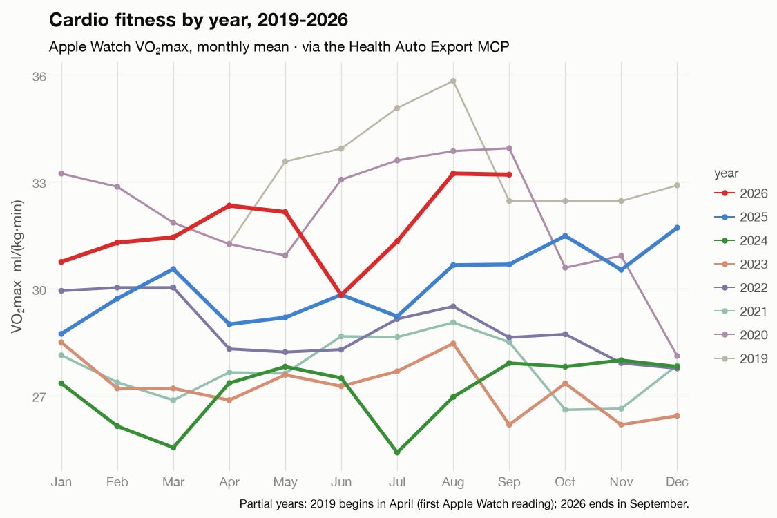
I wasn’t looking for this when I started this post. At first I was just curious about my overall fitness, as measured by VO2 Max:
or how about my resting heart rate?
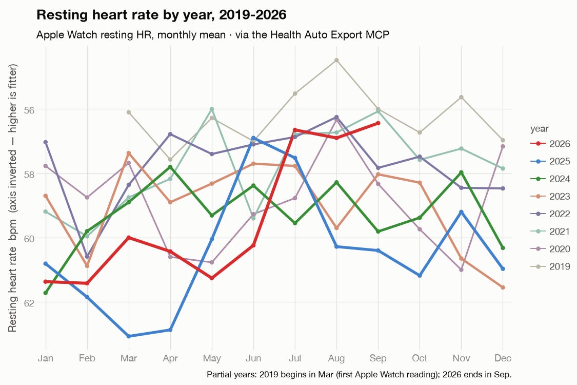
I know, I know, these plots are messy—it’s so easy to do that I let myself get carried away. But the point is that it’s now very easy to look up any of your Apple Health datapoints from as far back as you want to go.
While thinking about how to clean them up, I noticed something I hadn’t been looking for: a seasonality effect. So I asked Claude to plot the month-of-year effect on its own, separated from the year-to-year trend:
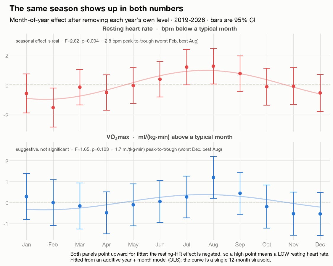
My resting heart rate is reliably ~2.8 bpm higher in February than in August (p = 0.004), and a sine wave explains 81% of the month-to-month pattern. Meanwhile my VO₂ max moves the same direction — best in August — though not quite enough to clear the data noise (p = 0.10).
Is it me or is it the calendar?
My wife and I do a lot of bike riding—but nearly all of it in the summer. Maybe that 2.8bpm swing is just fitness that comes and goes with our summer exercise. From my data alone, there’s no way to tell.
But that’s where the published scientific literature is helpful. Turns out other researchers using much larger sample sizes have noticed the same thing.
The biggest study, from a group at Scripps Research Translational Institute, looked at almost 100K regular Fitbit wearers and found population-average RHR (resting heart rate) peaks in the first week of January, falls to a minimum at the end of July, and climbs back.
Oura’s data scientists reported the same thing from something like 60K Ring users: December runs about 2.1 bpm above August. And even more interestingly, their users in Australia and New Zealand show exactly the opposite phase. Both hemispheres follow the length of the day.
What’s the mechanism? Nobody really knows, but a good guess is probably “sympathetic tone”. A 2015 study in Pennsylvania stuck special needles into dozens of volunteers to count nerve bursts. They concluded that resting sympathetic burst rate was almost twice as high in winter as summer. Other studies on high blood pressure are so persuasive that the European Society of Hypertension even recommends doctors consider adjusting medication doses by season.
Incidentally, because my 2.8 bpm is higher than what these studies report (2.0bpm), I might be tempted to think there’s something special about my results. But a population curve is the average of tens of thousands of individual waves with slightly different phases, and averaging out-of-phase waves shrinks the amplitude. I couldn’t find any results on the distribution of individual seasonal amplitudes, which is the number that would actually answer the question. My 2.8 could be perfectly ordinary.
Other seasonality
This isn’t the first time I’ve noticed differences based on time of year. Back when I was testing my microbiome daily (see Personal Science Guide to the Microbiome), I made this chart to see if I could notice if the diversity of my nose microbiome changed throughout the year. I had been doing regular (near weekly) nose samples, so I made this plot which seems to show maybe a little more diversity in the Spring and Summer (when there’s more active life in general), but less consistency in the Winter (when there’s more of a contrast between indoor and outdoor living).
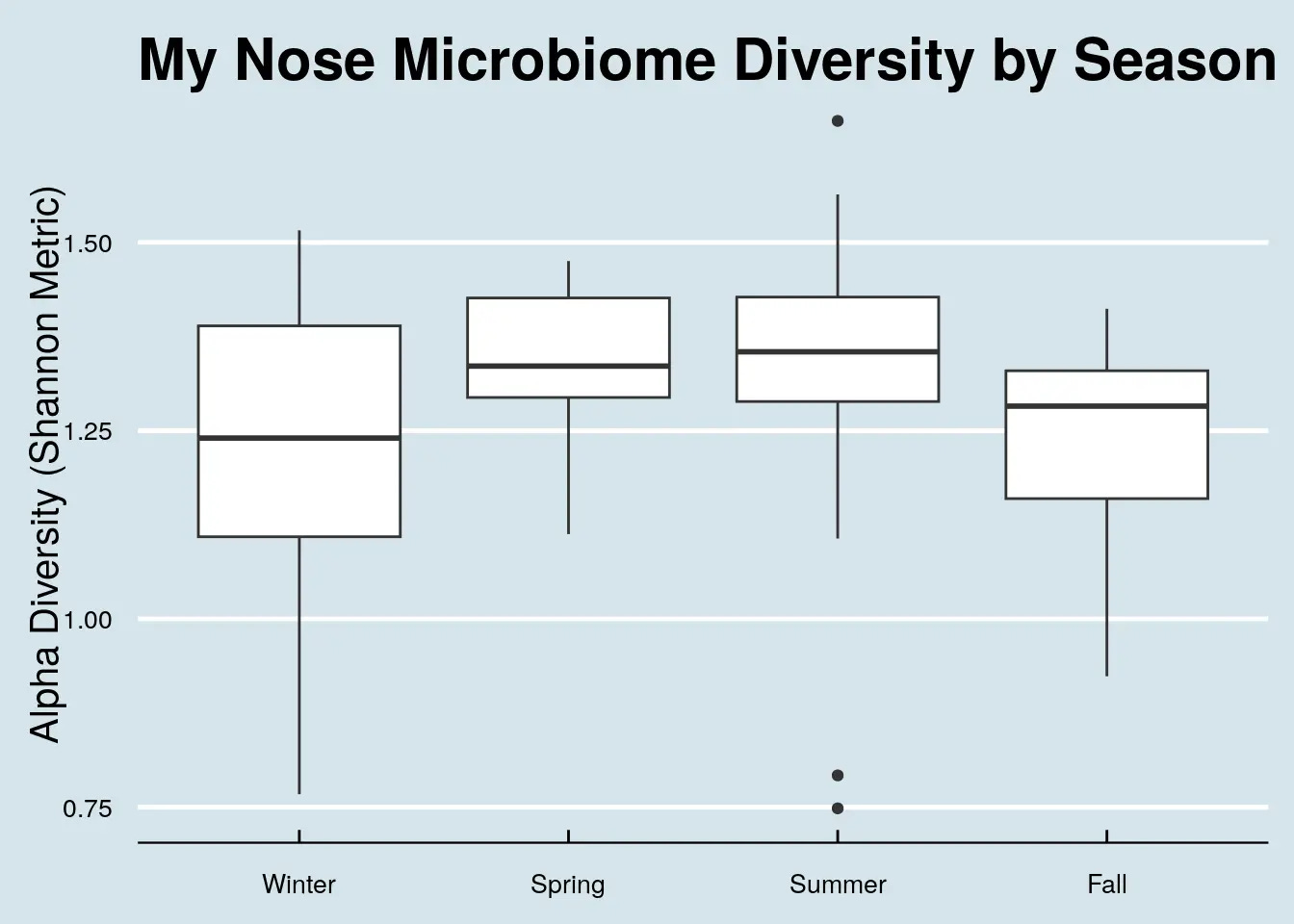
I haven’t run the numbers enough to claim more than “huh, interesting” for now, but it's the same lesson: you have seasons you don't know about,
Why this matters for other experiments
When I ran my magnesium withdrawal test last spring (PSWeek260514), my pre-registered resting heart rate endpoint was a change of about 1–2 bpm. That’s the size of a typical n-of-1 effect. It’s also smaller than the seasonal drift noted here, which means any experiment on RHR that spans more than a couple of months is fighting a tide of 2–3 bpm that has nothing to do with the intervention.
In other words, you can’t just compare your January baseline to your July result and call it a day. You’ll need to run additional corrections for seasonality.
Personal Science Weekly Readings
Speaking of flaws in heart rate measurements, Eric Topol’s The Big Holes in Wearable Heart Rate Variability and Readiness Scores is a must-read if you’re interested in Apple’s new “Readiness” score and HRV-as-longevity-markers. His conclusion, based on combing through the data: the devices are fine for within-person trends — which is exactly what personal scientists do—and much shakier for anything that claims to tell you about your future.
Also see his The Flawed VO₂ Max Craze that covers the other half of this week’s caveat: wearable VO₂ max estimates run 7–16% off lab values, and typically underestimate fit people while overestimating unfit ones.
About Personal Science
Personal scientists prefer to figure things out for ourselves. We listen to experts not because they’re necessarily right, but because they’ve had more experience than the rest of us. Still, experts are often wrong and frequently disagree with one another, so whether you listen to experts or not, you’ll need to make up your own mind.
We publish every Thursday for anyone who uses science for personal rather than professional reasons. If you have other topics you’d like us to explore, let us know.