
Many interesting phenomena come in predictable relative frequencies. Nobody really knows why, but in any region the second-largest city tends to be roughly half the size of the largest, the third-largest about a third, and so on. The same shape shows up in word frequencies, citations, website visits, file accesses, and personal habits.
This week I’ve been looking at examples of Zipf-like patterns in my own data.
Predictable Relative Frequencies
Anyone who’s worked on a large enough team is intuitively familiar with Price’s Law — the claim that the square root of contributors in a field produces half the output. Watch any episode of The Office: it’s pretty obvious which one or two people at Dunder Mifflin are doing the real work, and not always obvious what value the rest add.
There are good reasons to be skeptical when this is applied to your own work group — the original law (proposed by bibliometrician Derek de Solla Price in 1963 about scientific citations) has been empirically contradicted by later researchers, who found that real-world distributions are usually more skewed than √n predicts. But the underlying observation is real: outcomes are rarely distributed evenly. They cluster.
A more general version of the same pattern is Zipf’s Law. George Kingsley Zipf observed in the 1930s that in any natural-language text, the most common word appears about twice as often as the second-most-common, three times as often as the third, and so on. In English, the word “the” makes up about 7% of all words you’ll ever read; “of” is half that; “and” is roughly a third. Plot rank against frequency on log-log axes and you get a straight line.
The pattern shows up everywhere humans do things at scale: city sizes, citations, website visits, GitHub stars, app store downloads, book sales. It’s not a universal law — many systems are more skewed (log-normal, stretched exponential) — but as a first approximation for human-generated distributions, it holds remarkably well.
The interesting personal-science question isn’t whether this pattern exists in the world. It’s whether you can see it in your own data, and what it tells you when you do.
The Setup
I’ve had ActivityWatch running on my Mac since December, an open-source, local-first time tracker that I prefer over RescueTime (which we discussed back in PSWeek230720) because nothing leaves the machine. It records the foreground app and window title every few seconds, and a companion watcher flags when the keyboard and mouse go idle.
This is one of those tasks AI agents now do trivially. I just asked Claude Code to look at my ActivityWatch data and plot it. The whole pipeline took about ten minutes.
The Top 10
Six months (170 days), 786.6 active hours, 124 distinct apps:
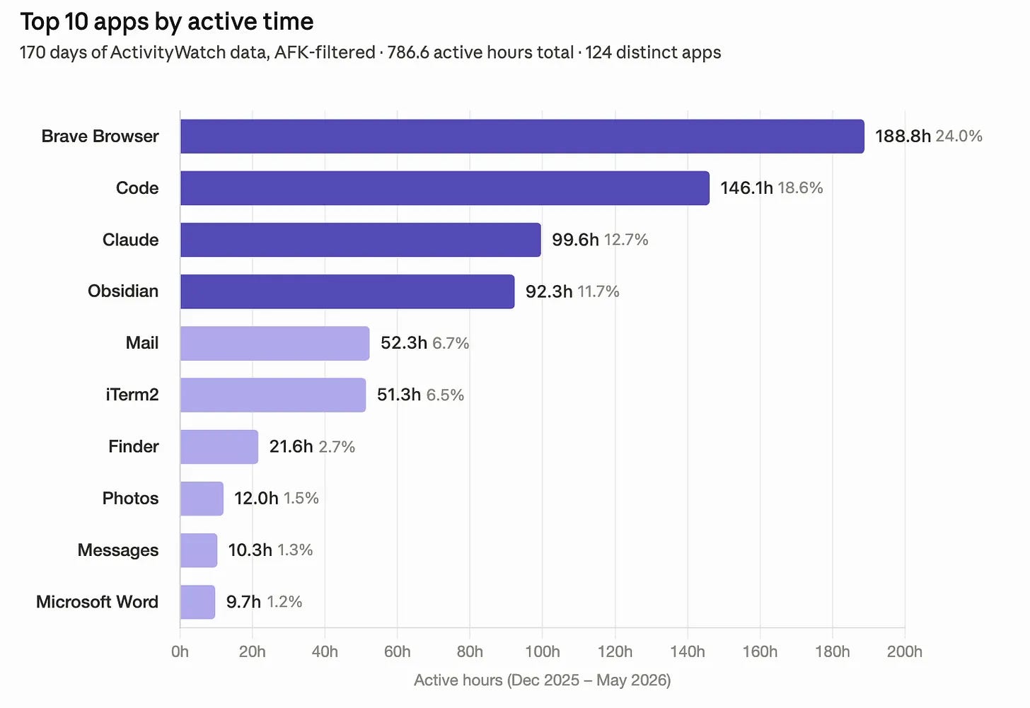
The top four — Brave, VS Code, Claude, Obsidian — account for 67% of everything. Five and six (Mail, iTerm2) push that to 80%. The tail of 118 apps shares the remaining 20%.
Is It Zipfian?
Yes — and more concentrated than Price’s Law would predict.
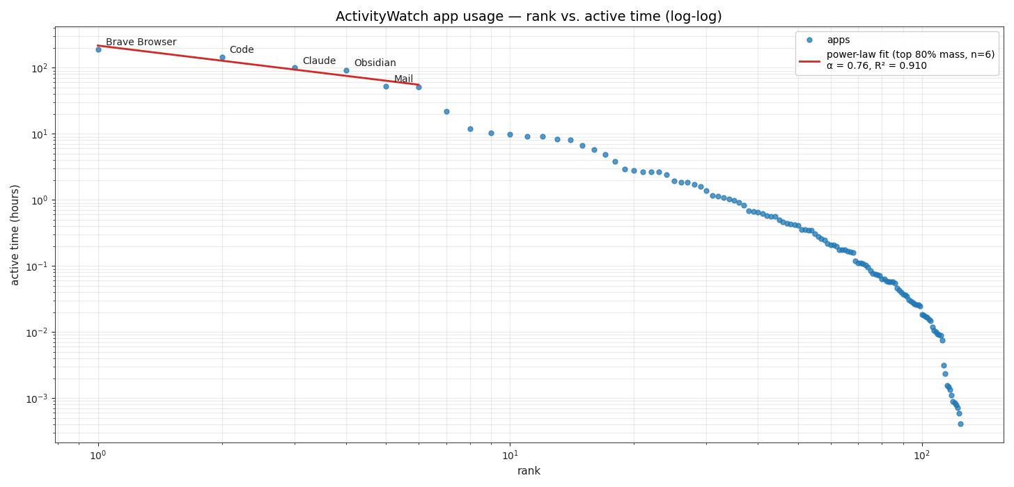
A canonical Zipf distribution has exponent α = 1: rank 1 is twice rank 2, three times rank 3, and so on. My fitted exponent over the top 80% of usage is α ≈ 0.76 (R² = 0.91). A shallower slope (α < 1) would normally suggest a less top-heavy distribution — so the exponent alone understates how concentrated my usage actually is. The story isn't in the exponent. It's in the cumulative share:
50% of active time → 3 apps
80% → 6 apps
95% → 21 apps
Price’s Law predicts √124 ≈ 11 apps should produce 50% of activity. In my data, 3 apps do. My usage is roughly four times more concentrated than Price’s Law claims, probably because my Brave Browser is really a whole bunch of apps, if you think of web pages as apps.
A Second Dataset: Voice Calls
My computer activity is one thing. Can I find a similar pattern in other data?
I pulled six weeks of my carrier voice log — 146 calls, 1,163 minutes, 32 distinct numbers. Both rankings below are Zipfian. Interestingly, the two different methods don’t rank the same people first.
Calls ranked by total minutes
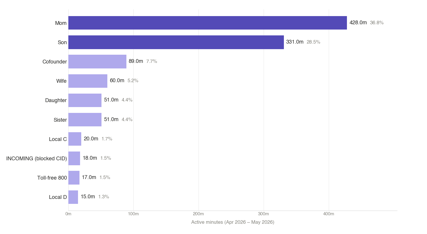
50% of call-minutes → 2 numbers (Mom and my son)
80% → 5 numbers
95% → 13 numbers
Price’s Law would predict √32 ≈ 6 numbers for 50%. The actual count is 2.
Calls ranked by number of calls
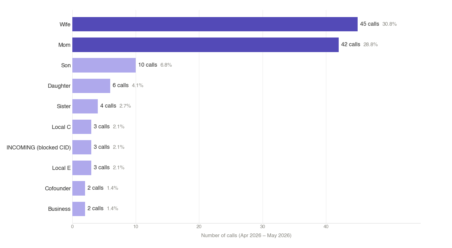
50% of all calls → 2 numbers (Wife and Mom — together 87 of 146 calls, 59.6%)
80% → 9 numbers
95% → ~20 numbers
The cross-metric observation
Look closely at rank 1 in each chart. My wife is my most-called number by frequency (45 calls), but ranks only 4th by duration (60 minutes). That’s about 1.3 minutes per call on average — quick “what time will you be home?” check-ins. Mom is the opposite: 42 calls but 428 minutes — about 10 minutes per call, real conversations.
Same dataset, two valid rankings, two different stories. Frequency captures transactional contacts. Duration captures relational ones. Neither one is “the” right ranking; they’re answering different questions.
A bigger caveat: the voice log is only one communication channel. My son shows up at rank 2 by duration because he’s in grad school building his own LLMs — a nerdy topic we both enjoy— so the calls run long. My daughters communicate by text and through their mother, so they barely register in my voice log even though they’re prominent in our family’s broader communication graph. A Zipf curve on one channel isn’t a Zipf curve on a relationship — it’s a Zipf curve on that channel for that person.
Why Time Isn’t Value
Before drawing conclusions, an honest caveat: time-on-app isn’t value-per-app, and call duration isn’t relationship-importance. Mail at 52 hours is mostly low-leverage maintenance. Obsidian at 92 hours produces the notes that become this newsletter. The 8 minutes I spent in Calculator might have been more consequential than an hour in Messages. And a 30-second call from one of my kids carries more weight than an hour-long sales call.
Zipf describes frequency, not importance. The wife-vs-mom contrast above makes the point cleanly: if duration were the only metric, you’d conclude I talk to my mother more than my wife — when really we’re just choosing very different communication patterns with each.
Why This Matters: Agency
In PSWeek250828 I argued that AI agents reward agency — the ability to delegate work without micromanaging it. Looking at the Zipf plots above reminds me of some of the potential consequences.
If three apps consume half my computer time and two people carry half my call minutes, the leverage isn’t in optimizing the long tail. It’s in being deliberate about the head. Am I using Brave for what matters, or am I in the browser by default because it’s where everything ends up? Is Obsidian time generating notes I’ll use, or am I rearranging tags? Could agents handle the Mail block (52 h, all maintenance) and free that for something the tail tells me I rarely do?
I want to think about this more — what the Zipf shape of your life means for how you should spend it, and what AI agents change about the calculus.
Personal Science Weekly Readings
ActivityWatch — open source, local-first, free. If you self-track, this is the right tool. Works on Mac, Linux, Windows, and Android.
Anyone with a Mac can do a casual version in two minutes: System Settings → Screen Time → App Usage. Less precise, but enough to see your own Zipf curve. Your iPhone Recents tab is the equivalent for calls.
Speaking of laws about productivity and expertise, in PSWeek240711 we showed why the famous Dunning-Kruger effect — the claim that novices systematically overestimate their own competence — is probably a statistical illusion rather than a real psychological phenomenon. A useful reminder that “viral” findings about human nature deserve the same skepticism we apply to nutrition studies.
The Kaguura Gichuru post (The Mathematical Reason Most People Never “Make It”) that got me thinking about this. Worth reading for the underlying intuition even if Price’s Law has been empirically contradicted by bibliometric researchers since the 1980s.
Finally pleaes note that I’m in New York City from now until late June, meeting a number of fellow personal scientists. If you’re in town, let me know!
About Personal Science
Personal scientists prefer to figure things out for ourselves. We listen to experts not because they’re necessarily right, but because they’ve had more experience than the rest of us. Still, experts are often wrong and frequently disagree with one another, so whether you listen to experts or not, you’ll need to make up your own mind.
When somebody publishes a viral claim like “the square root of contributors do half the work”, the personal-science move isn’t to argue with the abstract claim. It’s to check whether the pattern shows up in your data. Mine did, more strongly than the law predicts, across two independent datasets. Yours probably will too.
We publish every Thursday for anyone who uses science for personal rather than professional reasons. If you have other topics you’d like us to explore, let us know.